
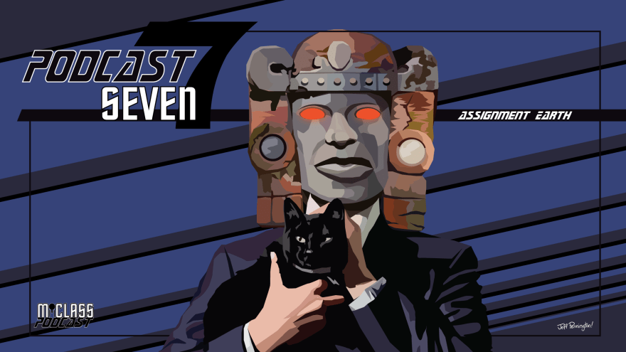
Hey folks,
I thought I’d take the time to talk a little bit about the genesis of this particular piece and how I went about making it because just looking at it doesn’t really portray the 40 hour struggle I went through and I’m nothing if not a big ol’ whiner so sttttraaappp in. For real though, I find this kinda thing interesting so hopefully you do too! I’ll use this as an opportunity to talk about my process on what I call “hard edge” art, as well.
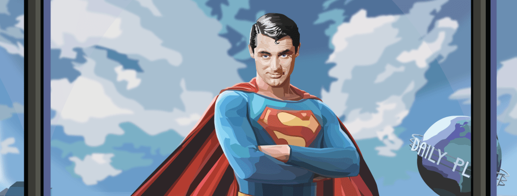
I can’t really take credit for the concept of a 1952 Superman film starring Cary Grant as Superman and Yul Brynner as Lex Luthor, that was the brainchild of longtime supporter and often commissioner SquidLudwig, who came to me near the end of last year with this genuine diamond of an idea and knew exactly how much it was going to take from both of us to create from the ground up. His support and patronage has kept me going more often than he even knows so a huge thank you to him right out of the gate before we even start to talk a little bit more in-depth about the piece.
Now for those that don’t know, if you see a piece of art that is all flat colors and hard edges then I’ve made that art using nothing but Adobe Illustrator’s pen tool. And for those that don’t know how that pen tool is used (a blessed people) it’s used entirely with the mouse and you basically click points to create a continuous line – and connect the first and last to make a flat shape. You can obviously do more with it than that, but that’s how it’s done, with a mouse, and that’s how I’ve created almost every piece of art for M-Class Podcast for the last 8 years. What the fuck is wrong with me? I wouldn’t even know where to start. Looks good though, don’t it?
I used to call this type of art “color field” but that didn’t feel super descriptive, also meant something else, and was stupid. So now I call it “hard edge” because that’s for sure not taken for anything else, right? Well, it basically means that there is no rendering in this type of art – every color is completely standalone and has a hard edge against the next – no mixing, period. This creates either the illusion of mixing colors and representative light or the exact opposite which can also be pretty sick visually.
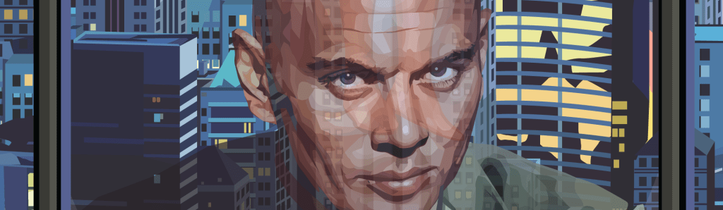
You can see the different hard edged fields of a single color a lot better when you zoom in on Luthor/Brynner’s face – some of them are actually quite large to showcase the planes of the face where light only hits in on direction, but most are incredibly small to give the impression of detail and light and shadow. You can also see at this level of magnification that I’ve done a lot less rendering on the city in the background and it looks a little bit more cartoony and less real but c’maaahhhhnnnn. That city took me a dozen hours easy as it is you want me to make it REALISTIC? You gotta be dicking my dick.
This becomes more difficult and time consuming the smaller the person is in the image but thankfully sizing is completely free in vector format so I can work large and size down. This does have it’s drawbacks though – I’ve learned that translating very intricate, detailed hard edge work from large to small ends up making the smaller character look really, really muddy and over-complex, so there’s a balancing act to it that’s necessary to maintain a cool looking art. Is anyone still reading this? Is this interesting?
This entire process is, as you could imagine, unbelievably time consuming. You could also imagine that maybe I’ve been trying to phase this out of my workflow a little bit to save my carpal tunneled ass wrist some torture; and you would be right. I’ve been attempting to create something as good utilizing standard art software like Photoshop or Clip Studio Plus (whenever I can pry myself away from work to make the full switchover.) This has had some successes and many failures.

I’ve found that using pastel brush equivalents in art software makes for an extremely fun and easy way to blend colors and render but it also does a decent job at more hard edge style art. It’s not 1-to-1 and has a different vibe, but it’s definitely the closest I’ve gotten to working. It almost comes off like a ‘sketch’ for what the regular Illustrator pen tool pieces look like, which is not the vibe I’m going for exactly, but IS a vibe I really fuck with so I’ve done a few pieces like this now. But I do imagine the pastel brush is just gonna be rendered fun pieces for the most part – it’s not a replacement.
Eagle-eyed viewers by now may have realized that this is just taking cel-shading to the nth level, above and beyond what most people do with it, and you wouldn’t be wrong at all. For those not dweebs: cel-shading is cartoon style style lighting of a piece, usually a character, with one or two colors of shadow and a light source – pretty much exactly what you see on cartoons past the Hanna-Barbera era and most all anime.
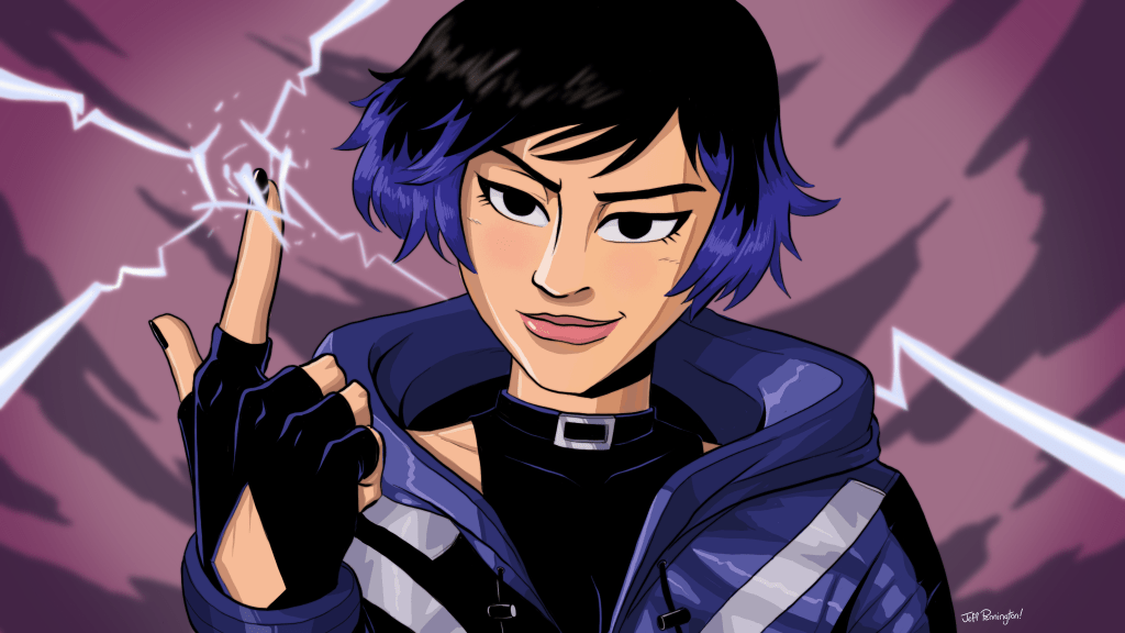
And you can kinda see in her jacket that if I really, really put my mind to it I could replicate this style just utilizing standard cel-shading. But there is one big roadblock: too hard for baby. I have a shaky caffiene addict hand and the inability to make sharp corners with standard brushes that has annoyed the shit out of my since I first started trying to draw digitally. I am working on this though. I consider this the absolute way forward for not having to rely on Adobe for anything anymore – there aren’t any real Illustrator replacements or stand-ins out there at all that focus on making vectors with a pen tool in the same way (that I know of.)
So in the end, what exactly was this blog post about? I don’t know.
Thanks for reading!
– Jeff
